My philosophy // thoughts about holistic digital design
All of this is work-in-progress so far, but let's start with something probably most designers will agree on
Explaining that "design" is not the process of making something only beautiful, is a life-long hassle which will probably never end.
First you've been the graphic person, you suddenly became an "art director" doing screen-design, then managed to become a "UX Designer", who is still called "to make it hübsch". Every next hip description was intended to solve the problem but eventually, it didn't ever change much what was expected of the person. (exceptions to confirm the rule) I won't even try to go into reasons why it is like that. It doesn't matter. Instead, I'll try to describe what I think design is about. This can be interpreted from different points of view, for now I choose the one about creating digital products as websites and apps.
Form
As a designer we create forms, shapes for the most different purposes. You can do it in print, designing anything from Logos and Business Cards to Corporate Designs. Online we create key-visuals, banners, info-graphics and more. The discipline is graphic design, the assignment is to some part really to make "it" beautiful.
Function
When we leave Print-Design and dive deeper into web- and digital design as a whole we soon realize that form is just the start. We need to think about function. "Form follows function" is what we can hear us think. So in the space of websites and apps we need to think about speed and performance, and the technical possibilities at hand. As good print-designers know about different paper and printing techniques, digital-designers need to know about HTML+CSS and the possibilities of App-Frameworks. And obviously that unknown stranger: „the user“.
If we combine Form and Function we do Product-Design and all it brings along as User Research, Usability, User Experience, Accessibility and much more.
Content
But neither an app nor websites are just made up of forms/shapes that only follow function and have a nice user experience. You could design a superb blogging platform, but without good content you're nowhere. Sometimes its user-generated content (social networks anyone?), it's your customers company info (corporate websites), the product catalogue (online shops) or the apps that are created in your ecosystem (app stores). Your job on the product side of things is to make sure you present that content in a "pleasing way" (Art Direction) and also make it accessible (Information Architecture).
Plus One
As you managed to create a product with awesome content which feels good and the whole thing just works, you might think the job is done. But no, you could still be an unethical a????e and making the world more miserable. The best example might be Facebook: great product, great intensions, great content and great execution – still unbelievable terrible for human society as a whole.
So to really have a great product, we always need to think about ethics at the core of everything. For example, and not limited to:
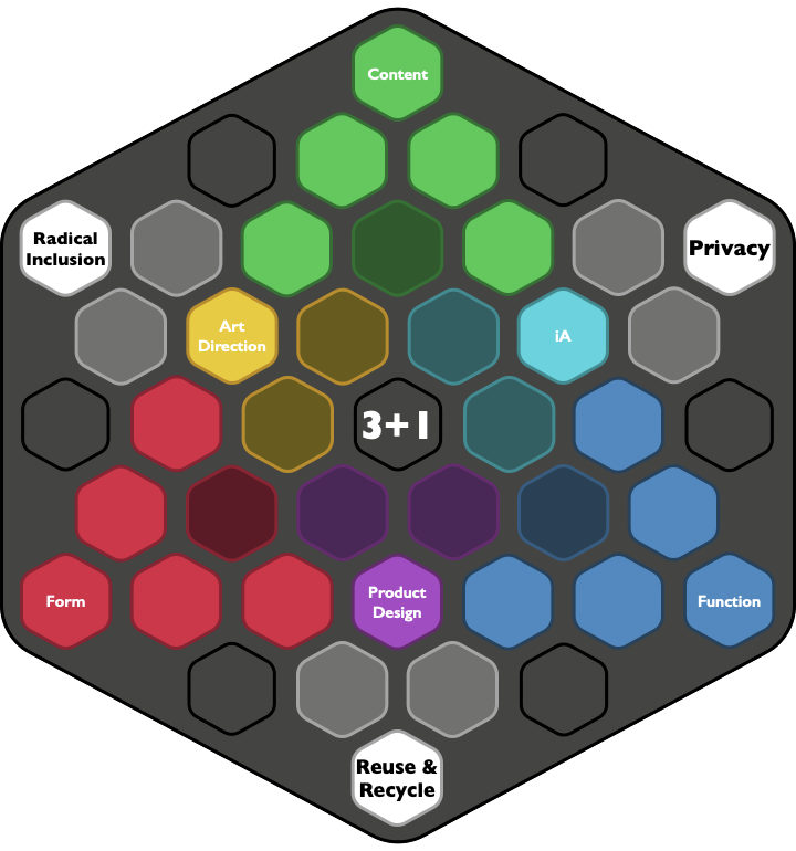
- Radical Inclusion — how many people can access and use your product
- Privacy — Protect what's not yours.
- Reuse & Recycle — There's an environment, a planet after all?
Visualisation
Hexagons are the Bestagons, just to have clarified that. Let’s use those to not make another terrible venn-diagram – but still have some visual representation. Form, Function & Content are the three main dimensions. On the axis between them are Art Direction, Product Design and Information Architecture as the actual disciplines between them. The Plus-One-Principles fill out the other three corners and needed to be thought of by their neighboring disciplines.

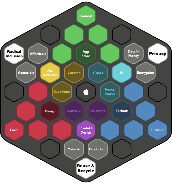
So let’s use that, and have a look at a prime example of product design: Apple. Over the years, they told as again and again, that they live at the „intersection of technology and design“. And that this is the reason for so much. The Mac, the iPhone, the latest Apple Silicon. But I’d say, they didn’t tell us everything.
Yes, form follows function at Apple. But this would be nothing without the content. And if you look at the iPhone as an example, the „mobile revolution“ started only with the App Store. Because through that, we have not just have finally a smartphone that works, we also have that great content.
Art Direction:
- The Store is carefully curated.
- Provide Guidelines for Developers how to make good apps.
Information Architecture:
- Make apps findable and accessible through the App Store.
- Provide Frameworks to easily access the latest hardware features
Product Design
- Tight integration of software and hardware
- Both well thought and at the top of their fields
On the "Plus One" things they're always keen to let us know a few things: They care about privacy (as they don't need it to make money), they work on Sustainability (repeat that Green-Report in every Keynote) and they tout the accessibility features on iOS and macOS. But of course Apple fails to be Affordable, adding that is the only thing they don't do and don't want to do.
TL;DR: Apple not just combines design with technology, it’s holistic approach includes great content, protects your data and the environment and products are as much accessible as possible. Just costly, but that’s the „one more thing“: never forget your business.

Conclusion
All of this is nothing ground-breaking here. Something that has been done many times. Just usually at places / companies where design is thought of more than „make it nice“. Apple being an example here, but definitely not perfect. It’s just that when you work in not design-oriented environments, it’s easy to forget that and loose focus. So I call this my „philosophy“ because it helps me stay concentrated, don’t loose my way and create better things in the end.
I named it „3+1“ and it can be applied to many things. Looking at products or companies through this lens, helps me to understand and learn why I like some, and others not so much. It leaves out business at it’s core for a reason. Business Thinking is undeniably important in the context of running businesses and sell products, but not so much in making the planet a better place. And I strive to make it better, even if – or especially because – I say all the time „Die Welt ist so kaputt“ / „The world is so kaputt“. Let’s make it better together!